New Website Launch: Girls Get Real
 We just launched a great new site for Girls Get Real. This new website is full of great features and creative touches. The company itself aims to motivate young women, 18-25, to live healthy lifestyles including making good choices in their personal life, career, education, relationships, etc.
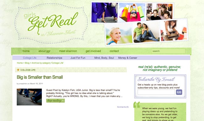
Bright colors, fun typography, and lots of photos really set a playful and fun tone for this great site. Read on to see more about the choices we made in the design and how the site is setup. See the new site at GirlsGetReal.com.
The Site Design
We had a lot of fun designing this site, and we love all the energy that it has. Shannon Short, owner of Girls Get Real, wanted the site to be approachable for the young women that she works with, and to embody their youthful spirit. She also wanted it to be really feminine without being pink and over the top girly. We came up with a design that’s bright and vibrant with colors that are fresh including a bright green and lilac as the two main colors, with touches of orange throughout. We also chose a feminine and fun typeface to complement the design that is used sparingly in the sidebar and a few other places throughout the site. Complementing and different textures are used on the site in different places to add more character and a unique quality to the design.

The logo design needed to set the tone for the site, giving users a good idea of who they were. So we used the same feminine typeface as the other headlines, with a double dotted line around it to to add some whimsy to it, and a swooping arrow in the middle that adds some more fun. Overall, it catches your eye and stands out as the focal point at the top of the design.

Photos were a big priority on the site, especially for this target audience, because young women identify with photos and they are great to express emotion and character. We came up with the idea of using photo strips in the header of each page to showcase multiple photos and give it a fun and playful look. There are quite a few sets of different photo strips used throughout the site that look and feel different. Shannon has the ability in WordPress to change out these image sets as she likes based on the content of the page.

There are lots of little details and hidden gems in the design, including faint words in the header that describe the qualities and ideas that are presented on the site including: love, relationships, dating, happy, girls, etc. The words vary in size and opacity to add some depth and a unique quality to the look.
The Site Setup
The site is run by WordPress and has a very custom setup to allow for everything GGR needed in their site. We also wanted to give Shannon full access to edit and maintain everything easily so we added lots of goodies in the admin panel to help make her job easier. The homepage features the most recent blog post from GGR at the top, and 3 other recently posted articles below that. Separating those 2 blocks of content is a bright lilac category bar. The categories of the posts were very important to GGR, and they wanted them to be prominent, so we kept this high up on the page so it would have a great place on the homepage for people to utilize.
The sidebar features some great items that were customized by us to include the right look for their site design. We also added some great custom items in the footer, making sure that the style matched the site as well.
Testimonial
Here’s what Shannon Short, owner of Girls Get Real, had to say about working with Snoack Studios:
I won my custom design in Snoack Studios’ 1-year anniversary contest, but Shannon gave it every bit of attention (and more) she would’ve given to a paying client. Shannon has great design ideas and her customer service is exemplary. She is uber patient, will listen to what you want and create a design for you that is sure to please! She truly cares about creating great design and making her customers happy!
Thank you for the kind words Shannon! We do love great design and aim for the very best for our clients. All in all, the site turned out great and we are so pleased with the look of it and how it functions. We would love to hear your thoughts on this great new site design in the comments below!
0 Comments »
No comments yet.
RSS feed for comments on this post. TrackBack URI
