Trends in Web Design: Responsive Layouts

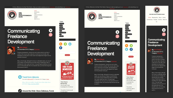
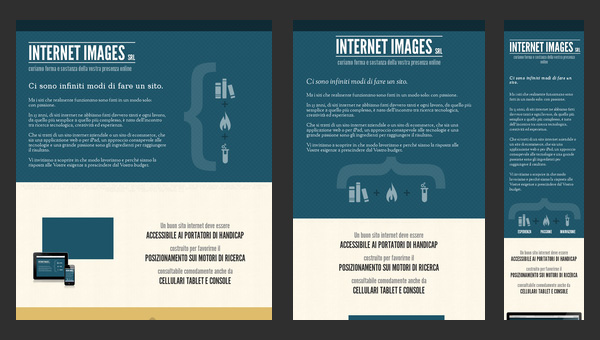
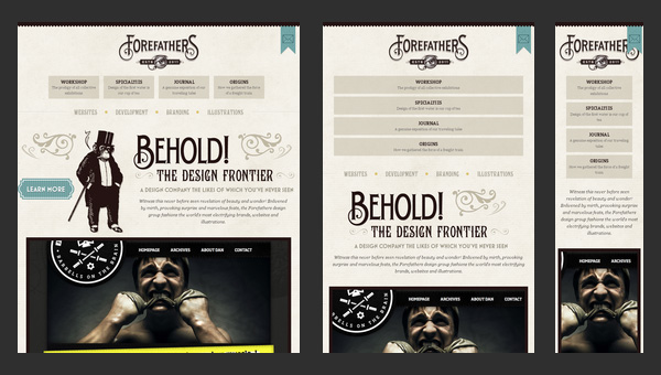
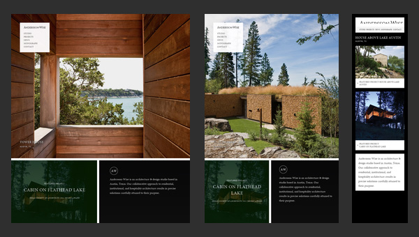
Responsive web design isn’t exactly a new idea, but it’s gained a lot of popularity in recent years, especially with people surfing more and more on tablets, phones and other mobile devices.
It’s a great technique to use to ensure your site looks great on any device. It’s not going to look the same on each device, but rather your site will respond to the browser and device size and appear well in any environment.
Read on to hear more about it and see some great sites that use it.
What Responsive Web Design Is
Smashing Magazine has a great definition of what responsive web design is:
Responsive Web design is the approach that suggests that design and development should respond to the user’s behavior and environment based on screen size, platform and orientation. The practice consists of a mix of flexible grids and layouts, images and an intelligent use of CSS media queries. As the user switches from their laptop to iPad, the website should automatically switch to accommodate for resolution, image size and scripting abilities. In other words, the website should have the technology to automatically respond to the user’s preferences. This would eliminate the need for a different design and development phase for each new gadget on the market.
Resize your browser while viewing the Snoack Studios blog to see a responsive site in action.
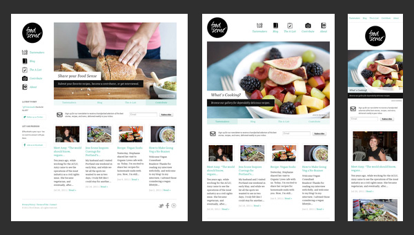
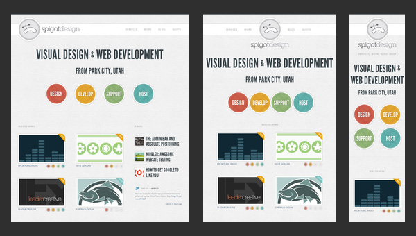
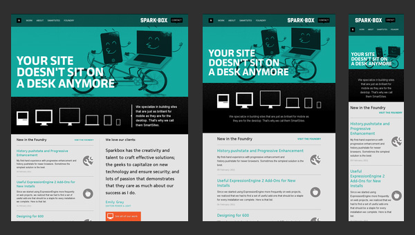
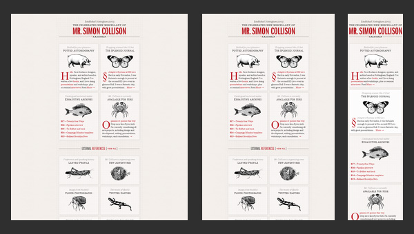
Great Examples
*These great examples were seen on Designmodo.
Have you seen other great responsive sites lately? Share in the comments below!
0 Comments »
No comments yet.
RSS feed for comments on this post. TrackBack URI

