A Color Study: Green Websites That Inspire
Color has been proven to be important in the look of your site and the feeling you give your visitors. Green in color theory not only symbolizes nature and growth, it can also be used to symbolize harmony and has healing powers. Green makes people feel safe. Websites that use this color can capitalize on these characteristics, giving users a sense of peace and safety on their site. Environmentally-friendly companies use the color green for the obvious organic ties it brings, plus the calm, spiritual message it sends to users. The sites below have inspirational and exceptional site designs utilizing the color green. Take note of the different shades of green, and the other colors in the color palette, and how these affect your overall feeling of the site.
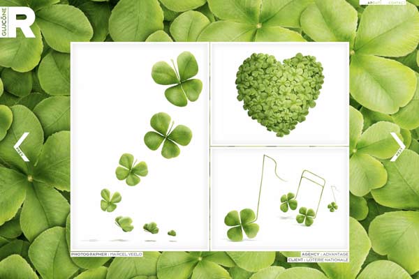
This nature-inspired site falls in step perfectly with the characteristics of green described above. The design looks fresh, clean and peaceful.
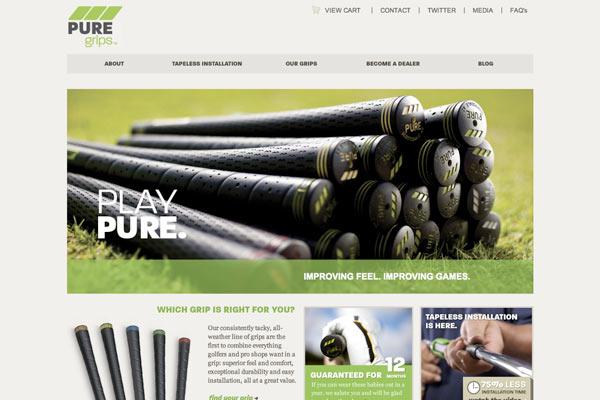
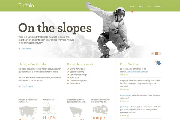
A minimalist and clean design, they use only accents of green. They utilize the outdoorsy quality of green, creating a clean and user-friendly design.
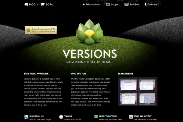
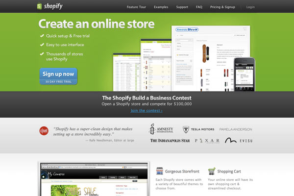
Combined with black, the bright green hues really pop. Black is a more powerful color and lends a dramatic look to the site.
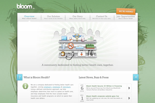
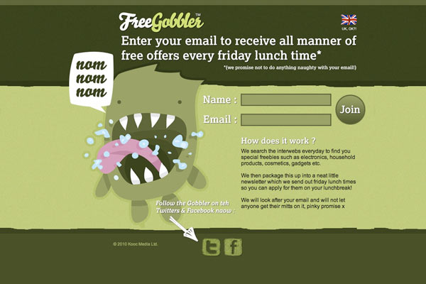
Organic brush strokes create a fun look in the background of this design and the green tones are a bit more subdued. The overall look is clean and the green balances out the site.
The bright green really stands out and looks very clean and fresh. Clean lines and bold colors make this design great.
This design is more illustrative and playful than some of the other in this list, and yet they use a contrasting muddy green color creating a fun look.
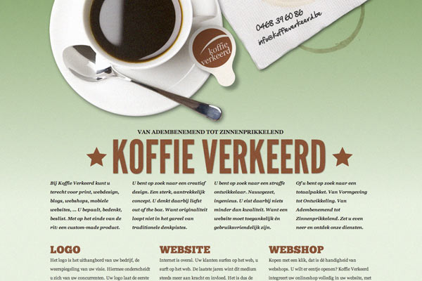
The design is laid back and minimalist with a focus on typography and large items. The green complements the other colors in the palette, creating a harmonized look.
More of a playful, bright green is used used and is paired with some fun fonts. The look is clean but playful and outdoorsy.
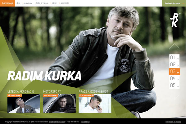
A darker green creates a more professional look and combined with a trendy photo and techy pattern it creates a hip and modern look.
Contrasting with the last one, this bright green really pops and creates a playful and fun mood for their simplistic and creative design.
As you can see, green can symbolize many things depending on the other elements used with it. It’s typical characteristics can fade away and take on a whole other set of values. Be sure to carefully select items in your design that represent the qualities you’re looking for and the mood you want your users to experience.
What is your favorite green site you’ve seen lately?
0 Comments »
No comments yet.
RSS feed for comments on this post. TrackBack URI
