Add Personality While Maintaining Professionalism

We’re talking about your website! Many companies struggle with making their website personable and friendly while keeping their top-notch level of professionalism. The two concepts can certainly be merged, without losing sight of who your company is and what you represent. You know that it’s important to be professional, but it’s also important that your website is approachable and makes people feel like they are welcome. Think of your site as a sales person or the entry way to your shop. If people feel that the vibe is cold and impersonal with any of those things, they aren’t as likely to want to do business.
For example
You might be thinking, but all businesses aren’t the same, what about something more serious like a bank or a corporate company? Charles Schwab’s site is a great example of a serious company, with an approachable website and brand.
They have a few splashes of bright colors, and some pictures of friendly-looking people to add personality. Their site makes you feel like although they are a large company, everyone is welcome and can feel comfortable here.
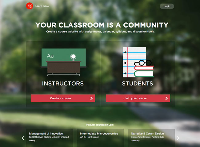
Lore is another great example of a professional company that has a personable site.
Their design is beautiful, featuring powerful images, bright colors and large, bold typography. You get a great feeling from their site, and instantly feel comfortable there.
Here are some more great examples of businesses that are putting their best foot forward with beautiful interfaces and interesting and personable designs.
The fun trend
Having fun is always trendy. People enjoy businesses that are having fun and allow you to have fun with them. It makes sense, if you can have fun while doing business with someone, you’re much more likely to want to do business with them, than their competitor that does the same thing, but isn’t having as much fun. If you have a serious product, you can still have some fun with it!
How to do it
Definitely make sure to stay true to your brand and your company, we aren’t saying that you need to misrepresent who you are. Instead, enhance your best qualities as a company and show that you can have fun, while maintaining composure and a professional presence. Some ideas on adding personality or fun qualities to your site:
- Add a bright color as an accent. If your main colors are drab and dark, choose an accent color that complements those, but brings a bright light to your branding scheme.
- Include some vivid photography. People identify well with photos, especially photos of other people that are having fun. There’s no better to show happiness than through imagery and photography.
- Choose a fun font. Even if your branding fonts are stark and plain, you can add a fun font as an accent throughout your site to include a note of personality.
Your website is a powerful tool for your business, and can certainly serve you well if done right. Make sure your design stays true to your brand, but welcomes people when they land there, so they feel comfortable with your company and want nothing more than to do business with you.
What are some great sites that you’ve seen lately that portray this concept well? Share in the comments below!
0 Comments »
No comments yet.
RSS feed for comments on this post. TrackBack URI

