New Brand: Oobee
Earlier this year we created a new logo for Oobee, a sister company to GeoComply. Oobee provides geolocation services to software companies, and they also have a smartphone app that is consumer-facing, a location checking application. The tech-savvy company wanted something simple and complementary to their current logo and brand for GeoComply, as well as a look that communicates the meaning of Oobee, which is “where be” or where am I. We wanted it to be happy, creative and technical-looking, and we love how it came out!

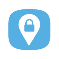
Oobee wanted the main symbol to have a smartphone icon look, because it would be used as the icon for their smartphone app. So we used a rounded square shape that is an echo of the Oobee “o”. Since the company provides geolocation services we also wanted to include a map pinpoint in the icon – and we integrated a lock in the map pinpoint to tie in the security aspect of their services as well. The blue used in the logo is the GeoComply light blue, and we chose a very modern and techy font for the text. The overall look falls in step with the company’s new flat design style, creating a logo that is modern, slick and professional.
Overall, this logo is sleek, stylish and very modern looking and we are so pleased with the results. Check out Oobee’s smartphone app and let us know what you think of the new logo in the comments below!
0 Comments »
No comments yet.
RSS feed for comments on this post. TrackBack URI