Build a Better Business Card

The business cards that you hand out for your company are a crucial marketing piece that need careful thought and consideration behind them. Cards that are done right can leave a lasting impression in a potential clients hand, and can have the reverse effect if done improperly.
We have some great tips on what to include and what to leave off, to give your cards the best chance of delivering the big punch that you’re hoping for. Check out our list and add your own notes and experiences in the comments area below!
Keep it small
The size of a standard business card is 3.5 inches wide by 2 inches tall, which isn’t a lot of space. It’s standard to make font sizes pretty small to fit well in there, but do make sure your font choice is still readable and works well for your audience. If you target an older audience, you may want to make your font sizes a little larger than average.
Make it brief
Don’t include too much information on here – it will end up cluttered and hard to look at. Do include your phone, email and/or best contact information for you. Including every social media link might be overkill, unless it’s pivotal for your business. Instead, pick one or think about including a small icon for each social media profile that you have. People will look you up if they want to find you there.
Make it visual
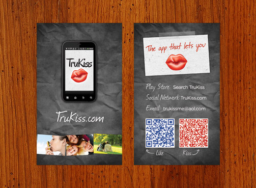
The most important piece of advice we can offer, is to make sure your card depicts your company well through it’s aesthetic appearance. The majority of business cards out there are mostly white and lacking in visual appeal. Add some color, images, patterns, textures, or whatever fits your company well!
Think about quality
The thickness and quality of your card are extremely important in the presentation. People will get a lot of information about your company through just touching your card – the thickness, paper choice, and texture all play a role in how people perceive your company.
Don’t forget the back
The back of your card is valuable real estate that shouldn’t be missed. It can be used to display pictures, your social media icons, or a map to your location. Definitely use the space, as it gives you more room to include information and visuals on your card.

What are your experiences with business cards and how people perceive them? Do you get comments on yours? Share with us in the comments below!
0 Comments »
No comments yet.
RSS feed for comments on this post. TrackBack URI


