Mobile-First Web Design

Mobile-first web design is a method of designing and developing a website that puts the mobile experience first instead of as an afterthought, which is how websites were traditionally put together when mobile browsing first started. Cell phone and tablet usage has done nothing but go up, with some people now using their phones exclusively to surf the web, never using a desktop computer at all. With more and more mobile-savvy consumers out there, mobile-first web design has been born to create a mobile experience that isn’t just an afterthought.
Why mobile-first?
Traditionally, you would plan out the full experience for your website with the desktop computer view in mind. Then, you would start scaling things back to create the mobile experience. Things have to be different on a mobile device because mobile screens are smaller, there are no hover actions allowed, and the view is more limited so it’s going to be a different user experience. Some sites keep all of the same content but they scale it back, and some even hide things from the mobile view in order to make it fit. So mobile users are often seeing a watered down version of a website with this plan.
With a mobile-first design, you start by planning out the mobile experience first, making the site look and function well on a mobile device, instead of just making it work. Then, you can scale up and add as needed, adding hover actions and the extra stuff that can’t be included on a phone. But with this plan the essential stuff is included from the beginning and it works and fits well because it was included in the original plan.
Mobile usage is only going to continue going up, and if some consumers are primarily using their phone and never using a desktop computer, they aren’t seeing your full website or getting the whole experience. Mobile-first allows mobile users to have a better experience with your website, using a site that was designed for the small device they are using.
How does it work?
Everyone has a different workflow that works best for them, but many people find it helpful to create a wireframe or rough guideline for where everything will fit with the mobile site first, then a tablet view, and finally a full desktop computer. Some people break it down even more into additional sizes, including vertical and landscape views for mobile devices and tablets. Buttons and touch targets need to be larger for mobile devices, accounting for the fact that fingers tapping the screen are larger than a mouse arrow on a desktop. Navigations need to be larger and have more space in between items to have them function well. After all of this is planned out and developed for a mobile device, it should be tested to make sure all of the different types of screens have a nicely designed experience that works well and looks like it’s designed for that space, instead of just made to fit.
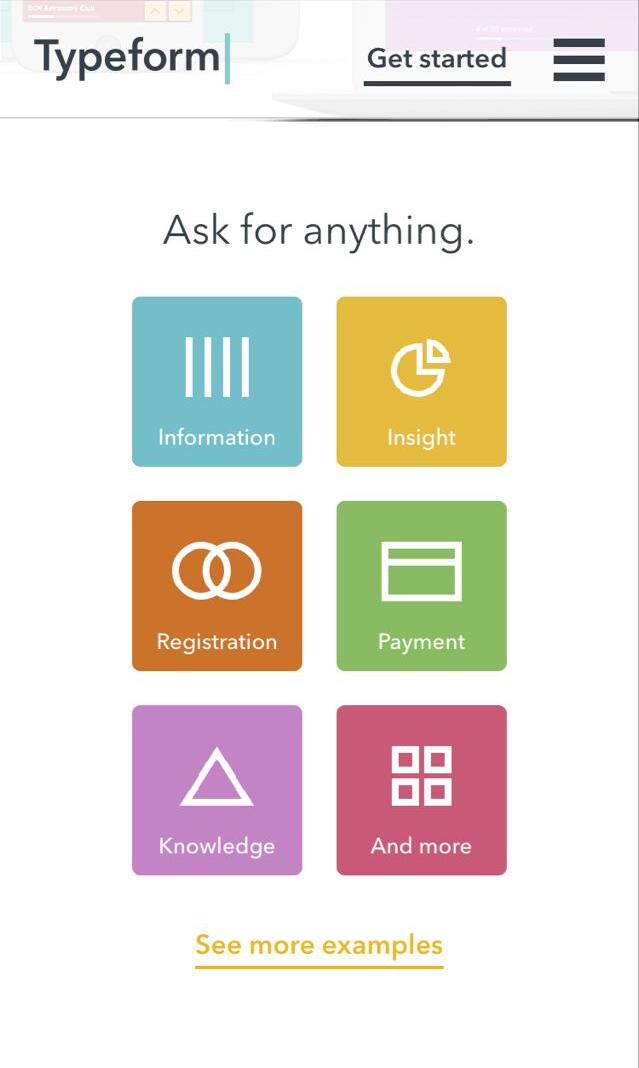
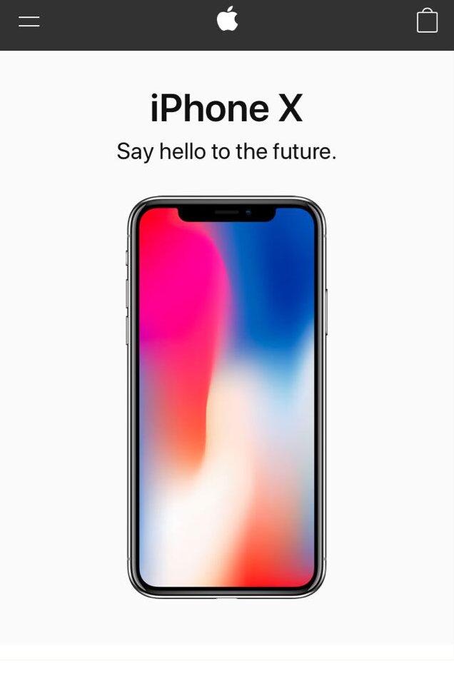
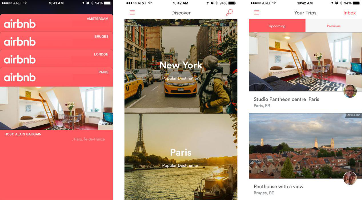
Great examples
These are some great mobile-first designs to show you how the design should fit well in a small mobile layout and caters well to a mobile audience.

Mobile-first design is still a newer concept but it’s gaining in popularity as growing mobile usage continues to dictate how websites should be experienced and designed. We would love to hear your thoughts on mobile-first design and if it’s something you think you will incorporate in your next website. Let us know in the comments below!
0 Comments »
No comments yet.
RSS feed for comments on this post. TrackBack URI